
I’ve always wanted to study psychology and after a full three semesters in IIT Kanpur, I was finally blessed (read allotted) with an opportunity. But the fates had something else in store for me and a certain turn of events - which may or may not have involved a very boring first class and the utterance of the sentence “drop the course” by a certain professor - I landed up with ART106: Elements of Visual Representation.
ART106 has been a liberating experience - and I’m not talking about the course load over here. Exploring art through the perspective of both an artist and an academia, you realize that there’s a lot of thinking that goes into creating a harmonious composition. So, here’s an overview of the evaluation model.
The course consisted of a mid semester examination, an end semester examination, an individual portfolio (which eerily disappeared from my study) and a final project - which turned out to really great, I think this has to with the fact that I had no hand (pun intended) in it whatsoever.
We had to present the artwork to the entire class (for the curious - Art 106 Presentation)
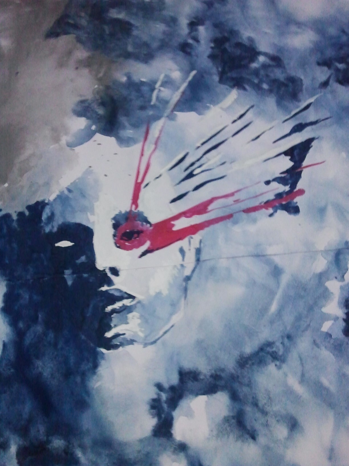
This is how our final submission looked like:
For the interested folks, an analysis of the submission:
Inspiration
The composition which we now call the face of Chaos is based on a semi-abstract digital artwork that we chanced upon in our search for inspiration. The original composition is very intriguing and bounds with many suggestive forms; what piques the interest of the observer is the conflict in the painting. Conflict between white and black, which comes out in the form of value contrast; conflict between absolute forms - the face and abstract forms - the haze. Despite so many active elements, there exists a harmony in the composition. This harmony and unity can also be attributed to the craftily placed faced in the composition. The high intensity red color and its strategic placement make it the clear focus of the composition and the viewer is drawn towards its enigma.
Medium
We chose the medium to be watercolors for we felt that only water colors could bring out the haze like forms in the composition. In retrospect this proved to be a really good idea because we were able to experiment with it. Instead of using it in the traditional way, we applied water to the entire painting and used a cloth swab to create the black clouds. So, what came out bore some resemblance to watercolors but had a better texture.
Analysis
The final composition that we came up with bore some resemblance to the original but we believe that we were able to portray a more chaotic composition. The face which acts as the focus point immediately draws the focus of the observer due to the intense red color which balances the lack of color in the composition. The composition represents a conflict between two colors black and white. While this can be blatantly put as a contrast between two values, this can be interpreted in different ways by an observer. We tried to create chaos in the composition, which could have been also created very easily using many colors but here we wanted to show the problem of choice. A choice can wreak chaos in one’s life, we are drawn towards due completely opposite ends and mind is in turmoil. A choice is always simple, like we could have chosen a very different painting but the difficulties it brings along are very difficult to explain - like the haze in the diagram. The face, which again is colored black and white represents the same choice pulling us apart. Ergo the color scheme is very simple black and white balanced by a stroke of red.
In the end what we believe is that this artwork is open to interpretation to the observer, what we wanted to portray was the choice and the chaos it brings about one’s life. And we believe that the viewer can empathize with this painting and come up with various interpretations.